2026/ Multivariate testing, personalization, mobile design
Multivariate experimentation of personalized in-app messaging
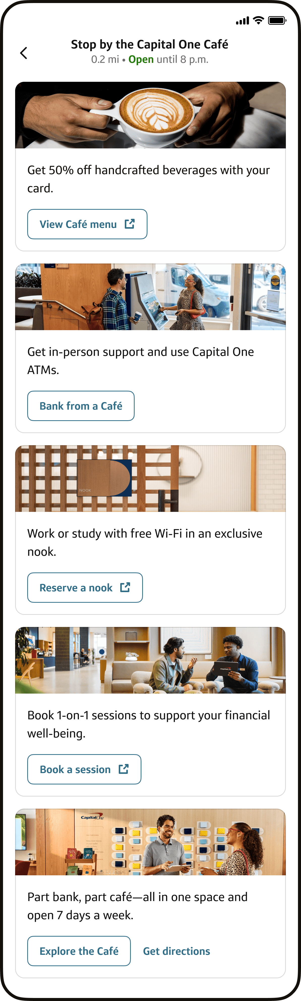
Capital One Cafés are proven to increase the stickiness of our relationships with our customers. I led design work to move our messaging about the Café on our mobile app's home page from generic to personalized, designing 5 variants based on product type and user journey, tailoring messaging to drive awareness and visitation. Results coming soon, this work is in associate pilot and will launch to customers in July.

We believed that tailoring messaging about the Cafe could increase awareness of Cafe offerings better than our existing generic messaging.
The Capital One Café is proven to build stickier relationships with customers.
Data shows that just being aware of the Capital One Café makes prospects more likely to open an account. For existing customers, visiting a Café is correlated with having a higher likelihood of having a primary banking relationship with us.
Past work proved that in-app messaging built awareness of the Café.
Past work had proven that consistent messaging was more effective than seasonal marketing messaging in the app, and that credit card and bank customers are interesting in learning more about the Café.
We were underutilizing prime real estate on our mobile app home page.
We showed the same generic content to every customer, credit card and bank account holders alike. Messaging about benefits like 50% off coffee or free reservable workspaces were forgone for content that could apply to all audiences.
I started by working with product to sharpen requirements into a testable set of variants.
When I started the work I noticed areas where clarity was needed to move forward. I started working immediately in low fidelity so we could give leadership visuals to react to and have clearer conversations around requirements.

I ran a cross-team alignment workshop early to streamline approvals later
Past phases had stalled in approvals. I brought together product, design, and marketing from both our team and the app home page team to get feedback and find any issues early.
Pay off: At our intent review and design review, home page partners said the work had been vetted, smoothing the approval process.

Visual iteration based on home team feedback
The home page design team had concerns about tile height and how new layouts might affect page performance. Everything I showed them was shorter than the previous tile. I iterated on new layouts with their constraints in mind, even though new layouts were scoped out of our final designs.

Final designs:
5 personalized variants, 5 novelty control variants
Our test was designed to pinpoint what moved the needle, with 3 treatment groups: BAU, novelty control (personalized images but generic text), and our personalized variants (personalized images + text).

We scoped out one of our variants to make sure we could meet our deadlines
A carousel design targeting customers within 1 mile of the Café was scoped out when our iOS team was reduced to one entry-level developer. It would have consumed 40% of development time and we knew we could still get clean results without it.

I created a framework to make Phase 4 faster to scope and easier to prioritize
I created a framework to map how the tile could change across different moments in the customer journey with potential data signals to help prioritize the next phase. My product partner is excited about the framework and is already planning to use it for prioritization.

Impact coming soon
This work is rolling out to customers throughout July, and performance data will be collected throughout the next 3 months.